This project was completed as a conceptual case study.
The vibe to capture was warm, delightful, and homelike. The audience of this event are family and most senior groups. Inspired by mid 1900s vintage posters, I harmonized the retro typeface with the illustration. The large title typeface and the diagonal hand illustration create the whimsical and active atmosphere to the poster.
Process
I first created an illustration asset to include in my poster. I researched the foods that are often offered in fall potluck such as lasagna and turkey. Then I created an illustration to have them altogether.
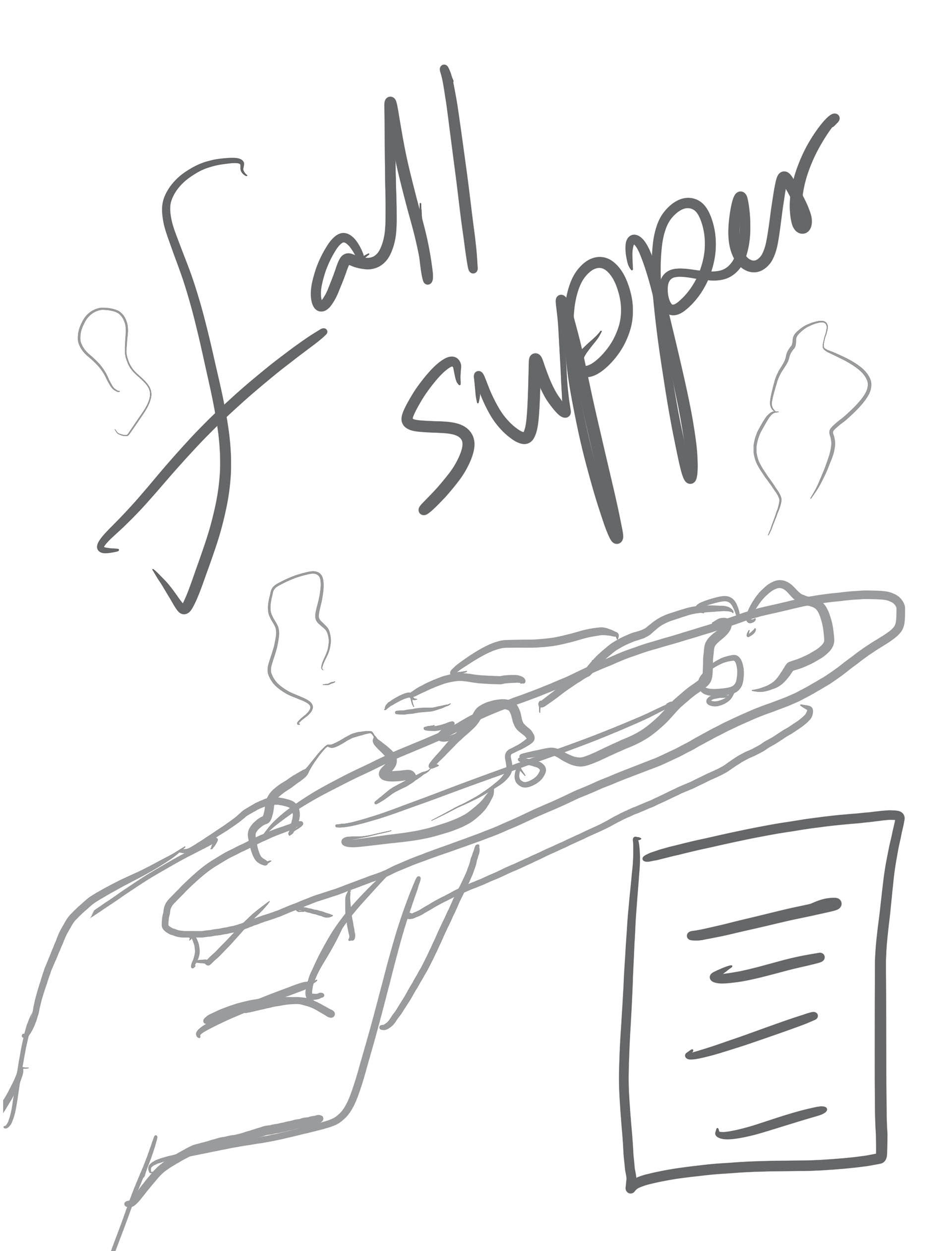
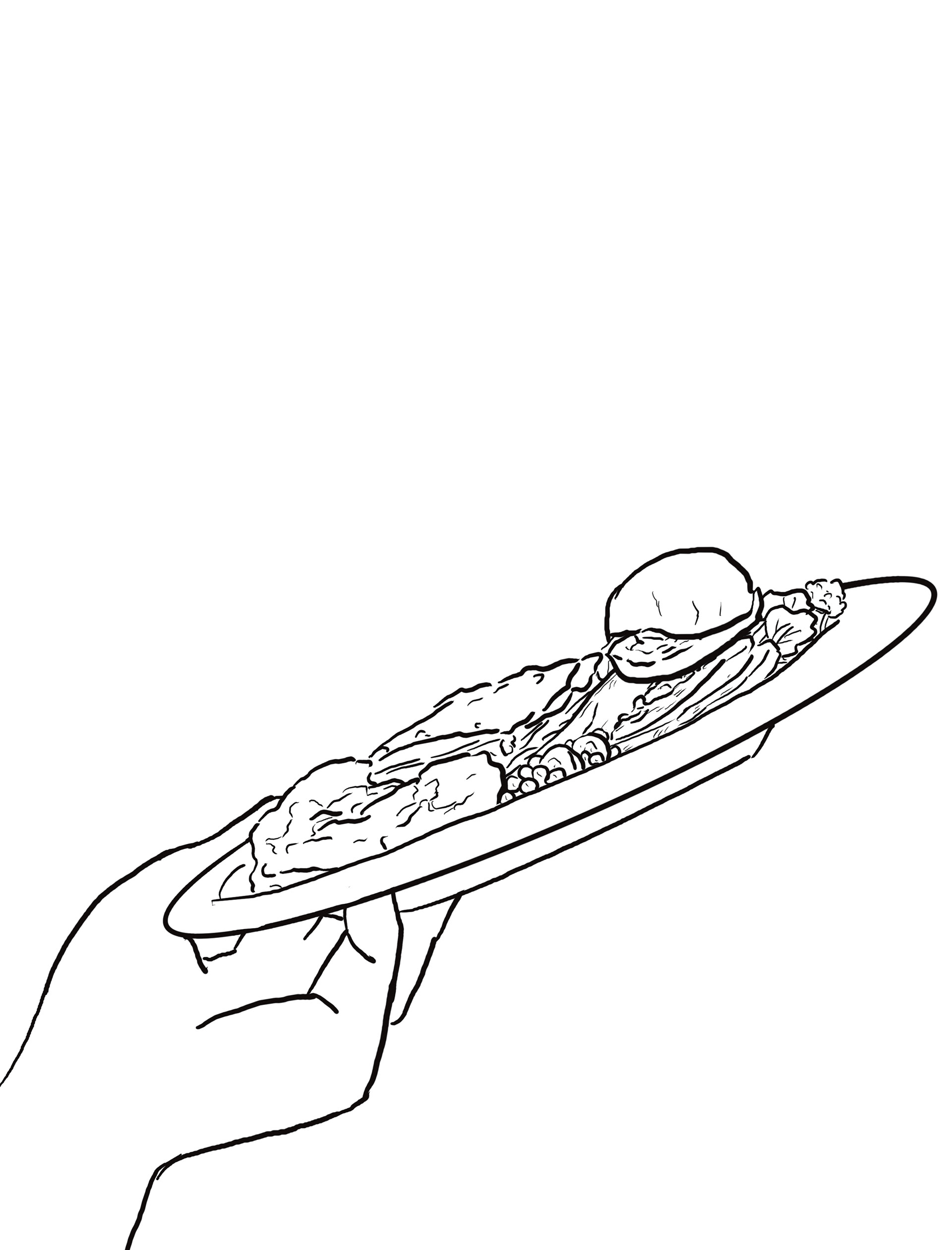
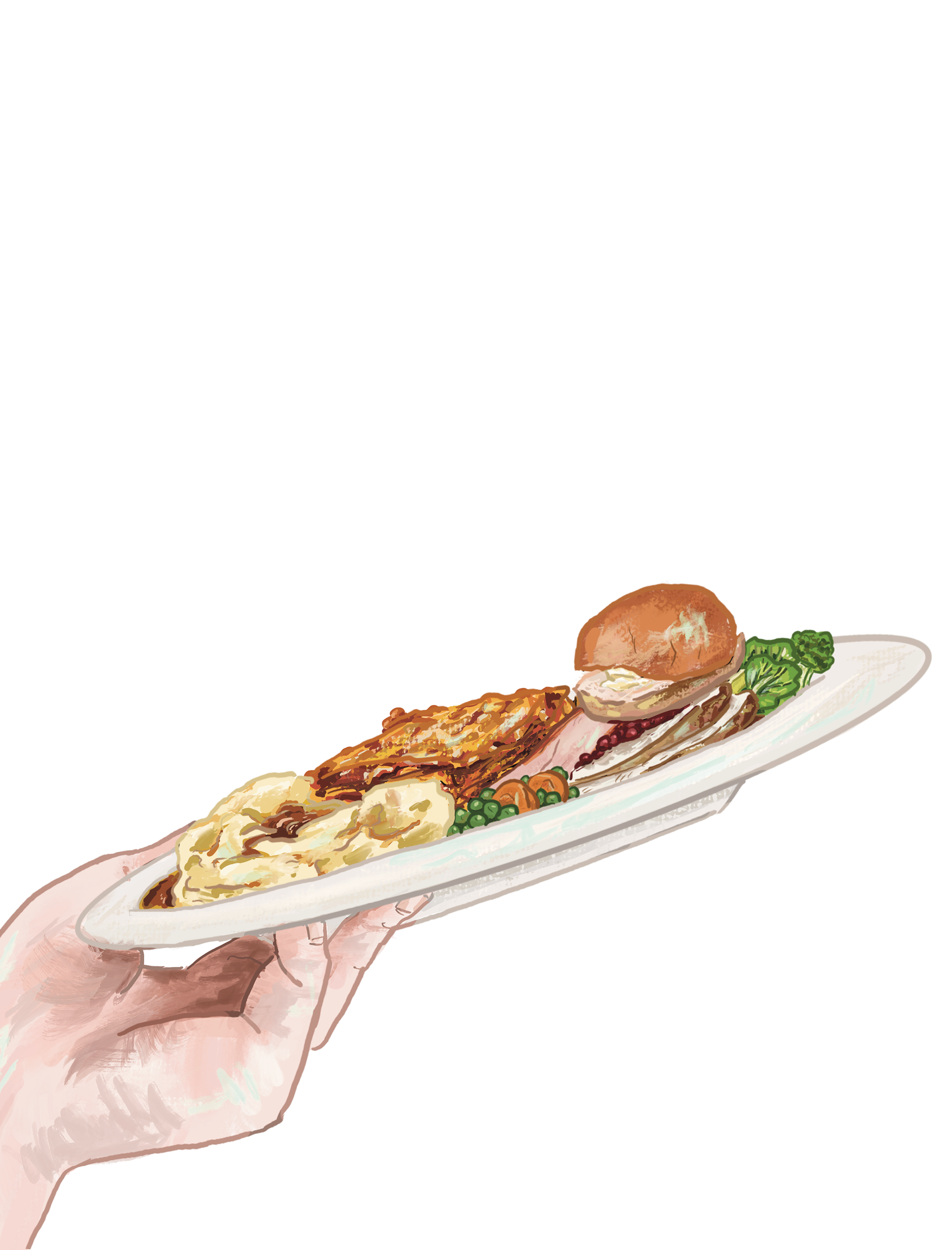
After that, I explored typeface options to add retro atmosphere to my poster.
I adjusted some typeface features on Adobe Illustrator.
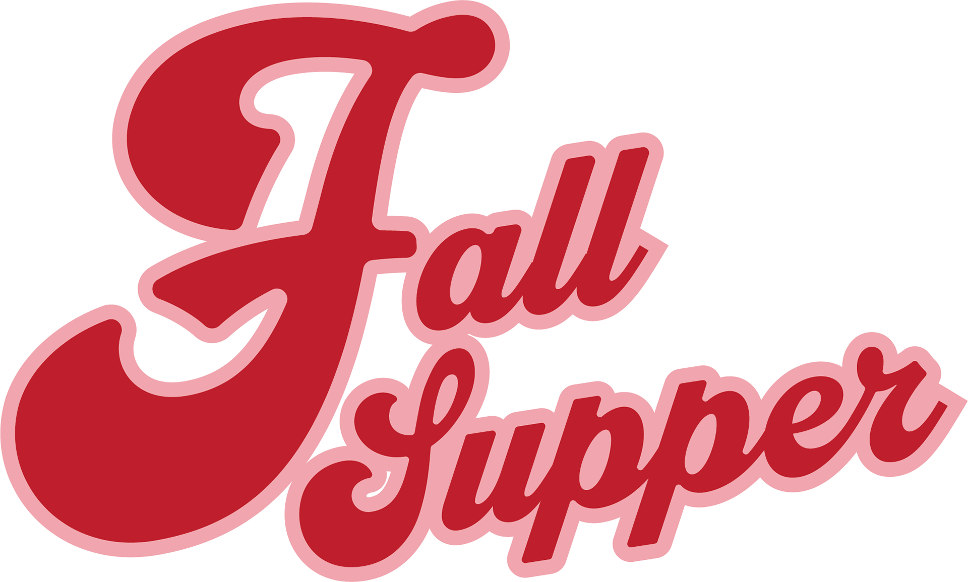
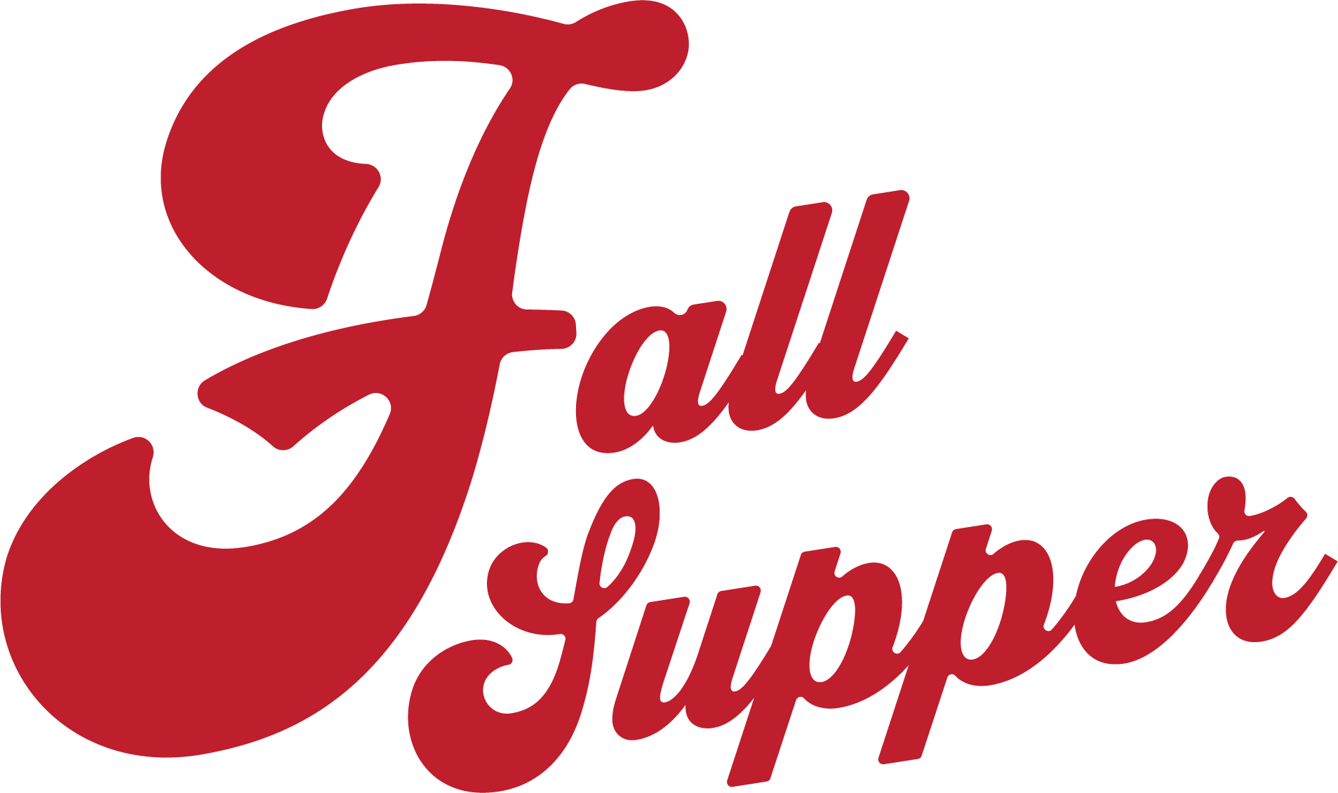
Then I changed the colour of the title typeface and adjusted the overall tone of the poster. The pumpkin spice colour targets the fall season and the food symbolically. The brush strokes on the title creates the painterly consistency with the illustration. This also implies the steam from the food when they just got cooked.

