This project was completed as a conceptual case study.
The Solution:
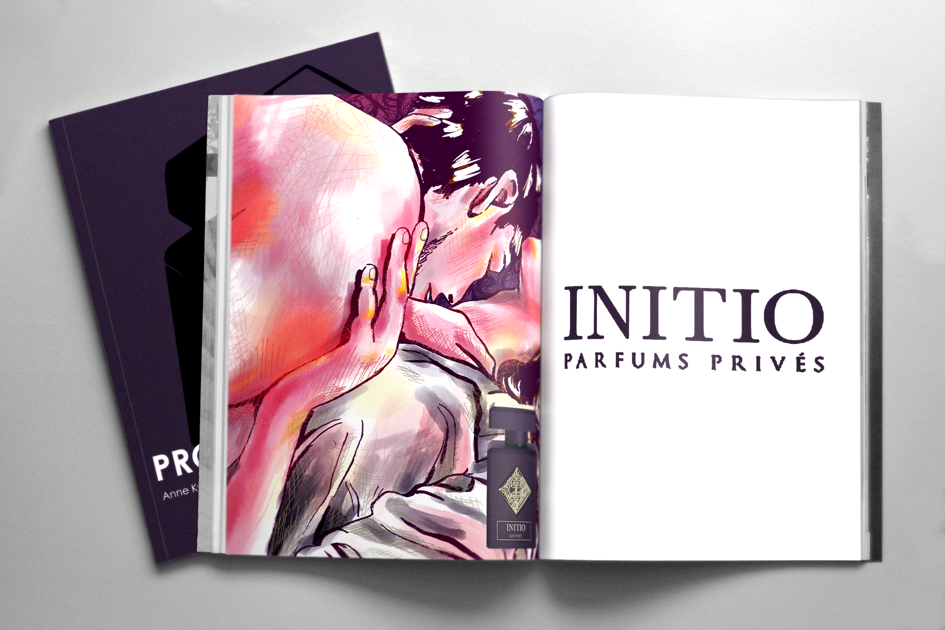
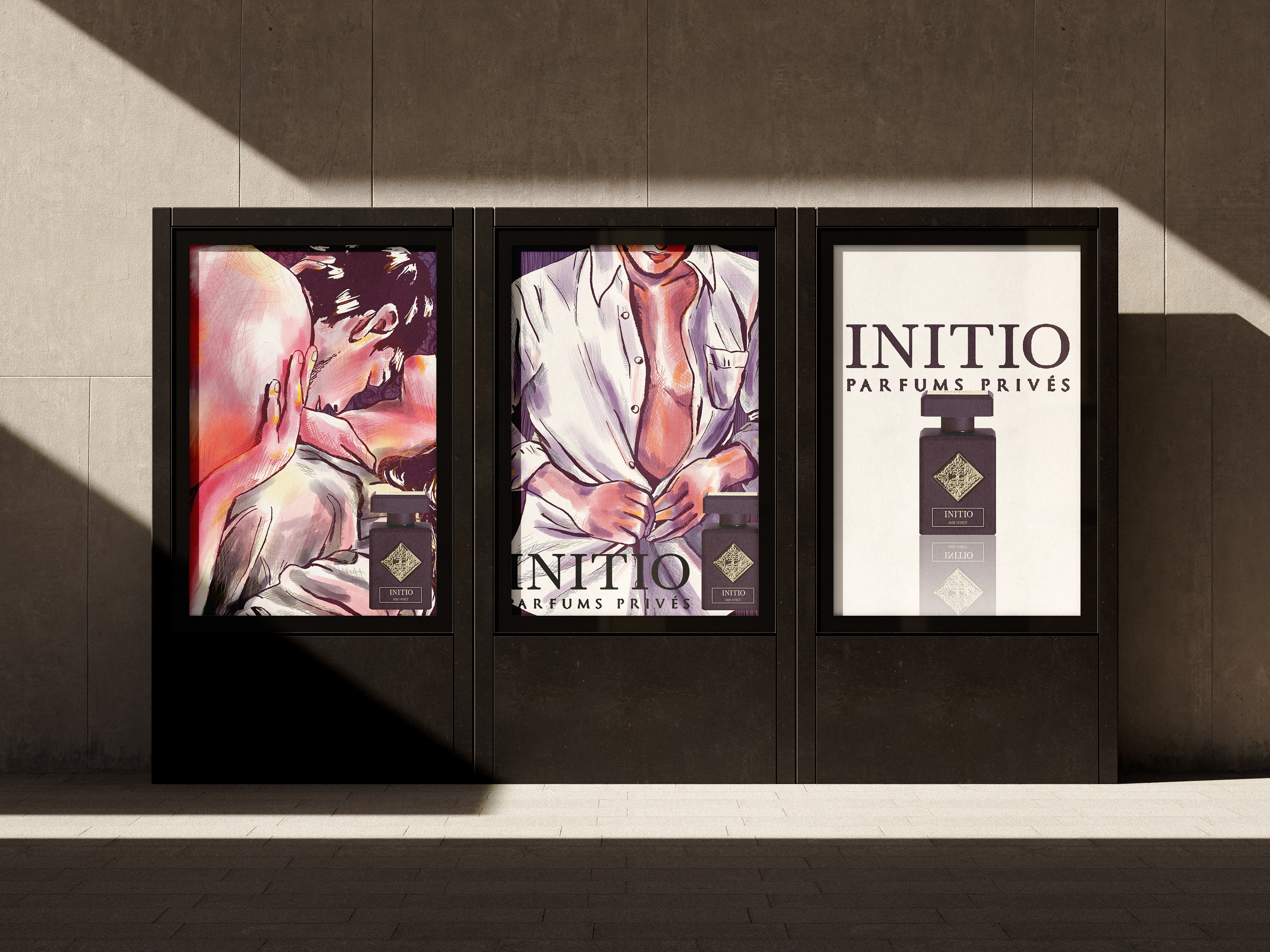
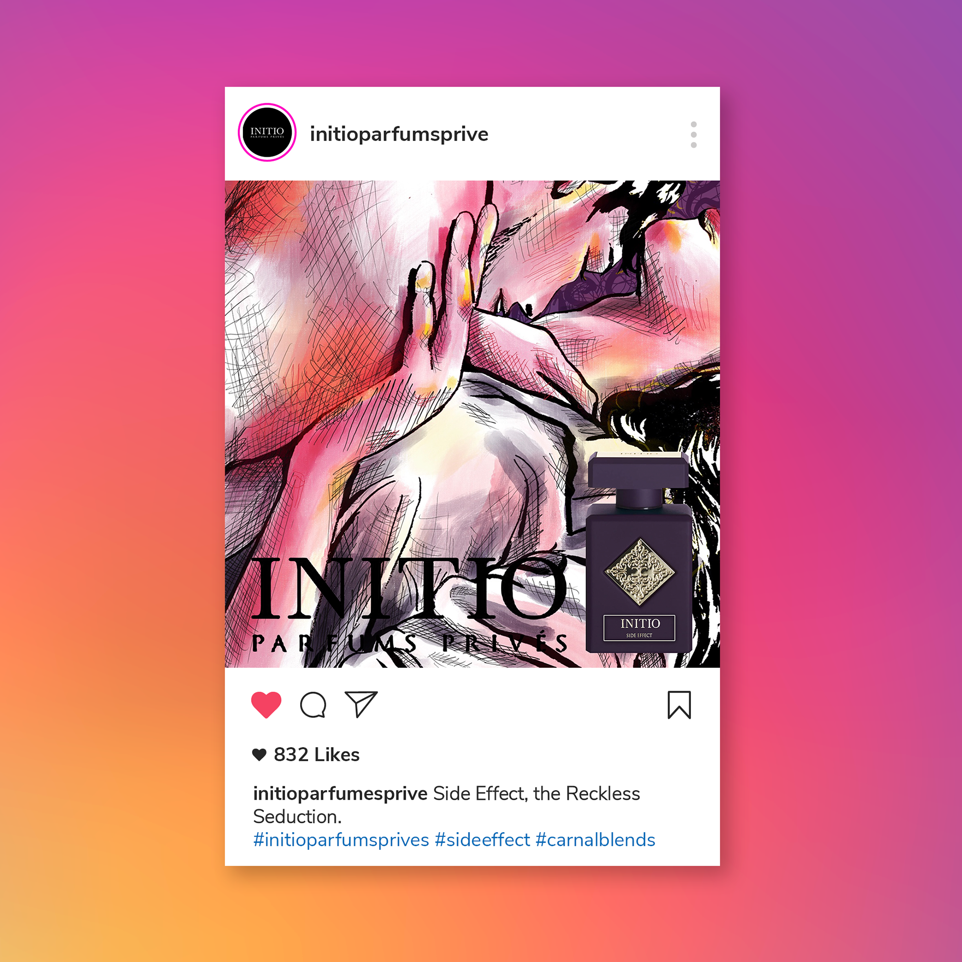
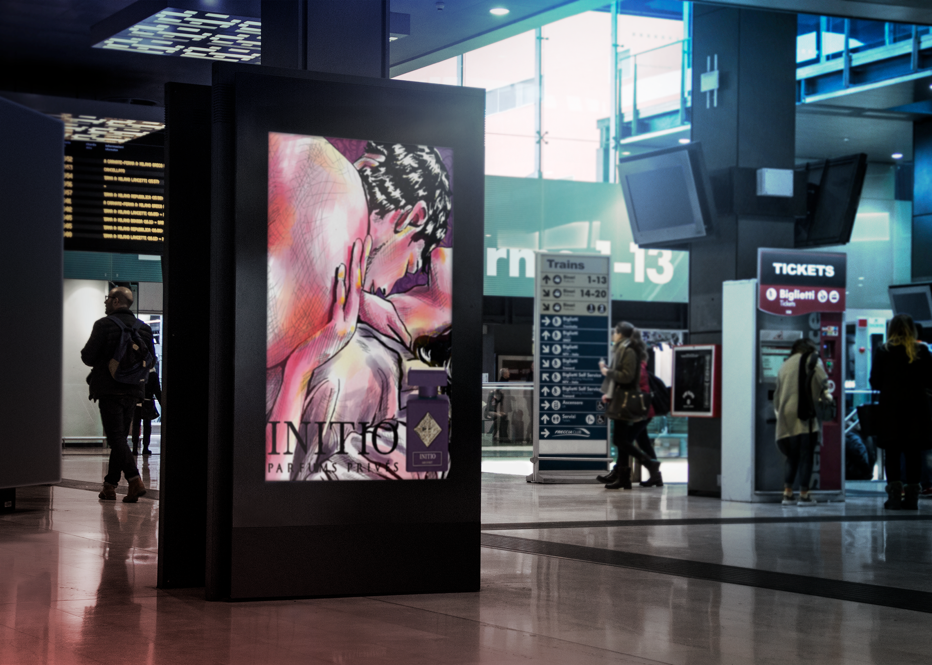
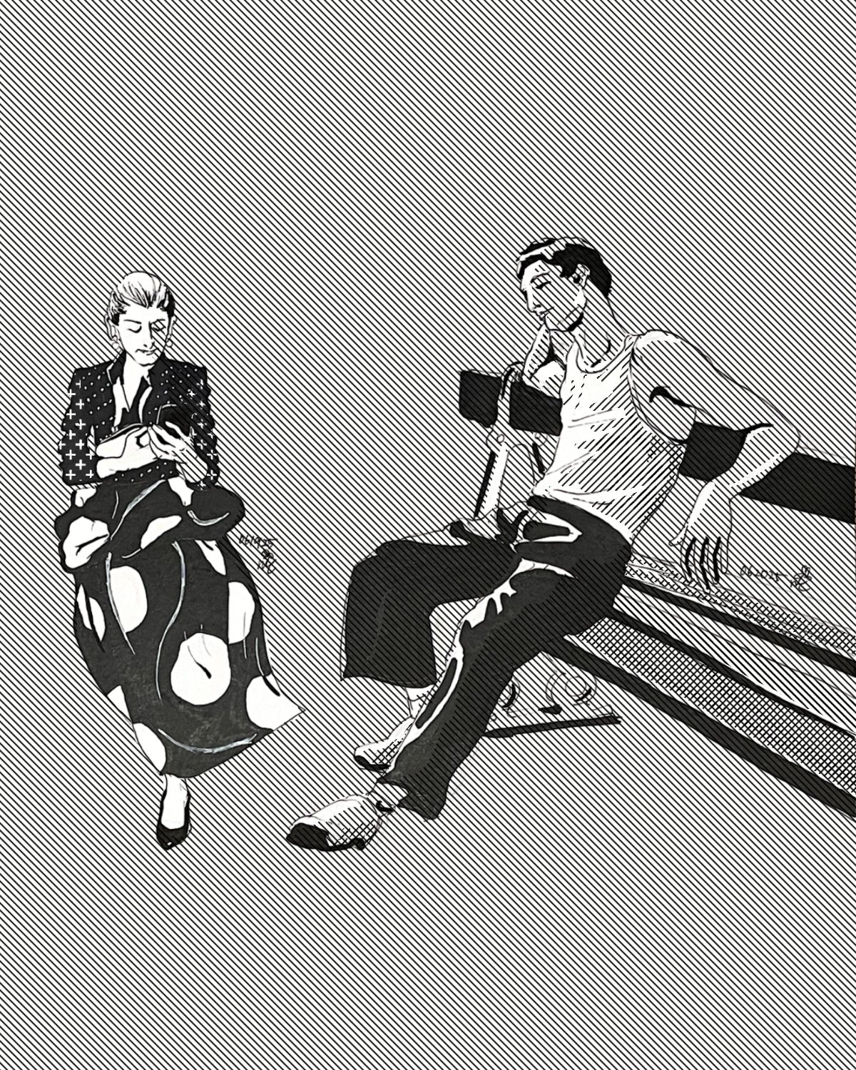
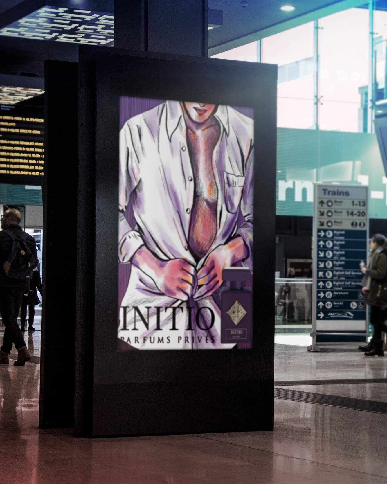
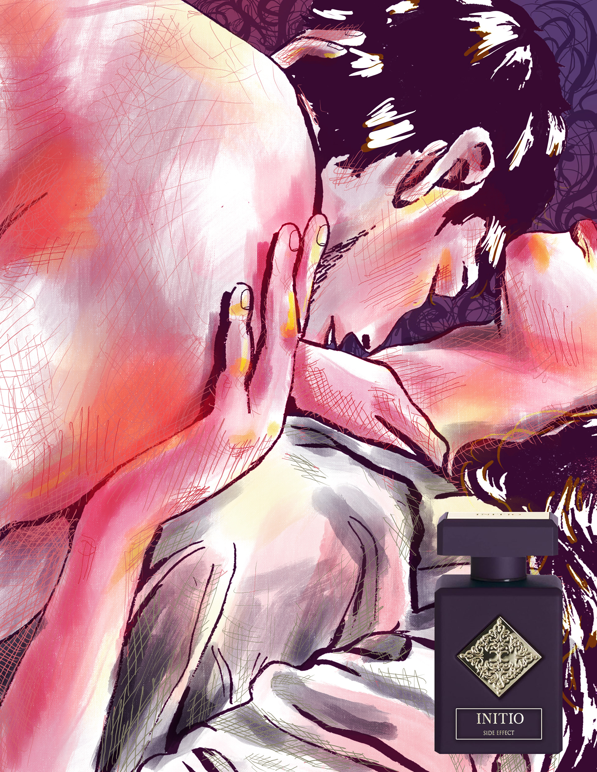
For the promotional illustration, my goal was to visually capture the dominant and seductive personality of Side Effect. I developed two illustrations to express this, drawing inspiration from fashion illustration aesthetics and the fragrance's key notes — particularly tobacco and rum — to guide both the composition and colour palette.
This illustration depicts a couple, building on the first to create a cohesive narrative arc. To distinguish the mood of each piece, I used contrasting line work in the backgrounds — vertical lines in the first to project power and intensity, and curvy lines in the second to suggest intimacy and sensuality. The colour palette of red, orange-yellow, and purple was chosen to represent desire, the rum note, and the mythical quality embedded in the brand. I worked with traditional ink pen and Procreate to achieve an expressive, experimental quality fitting of fashion illustration.
When arranging the illustrations for layout, I approached it as visual storytelling rather than pure composition. I experimented with the triangle motif to echo the brand's sense of power, and made deliberate sequencing decisions — placing the shirt illustration opposite an inverted triangle logo to open with dominance, then following with the couple illustration to build narrative momentum.
Final Composition
Mockup