This project was completed as a conceptual case study.
The Problem:
Attract non-music professionals to Antelope Audio and envision their vision to the audience more intuitively by redesigning their logo.
Attract non-music professionals to Antelope Audio and envision their vision to the audience more intuitively by redesigning their logo.
Target Audience:
1) Non-music professionals who seek a higher quality of musical products.
2) Antelope Audio long-term customers.
3) Antelope Audio Staff.
1) Non-music professionals who seek a higher quality of musical products.
2) Antelope Audio long-term customers.
3) Antelope Audio Staff.
Solution:
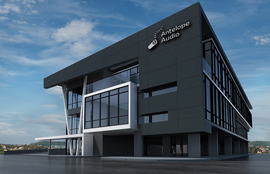
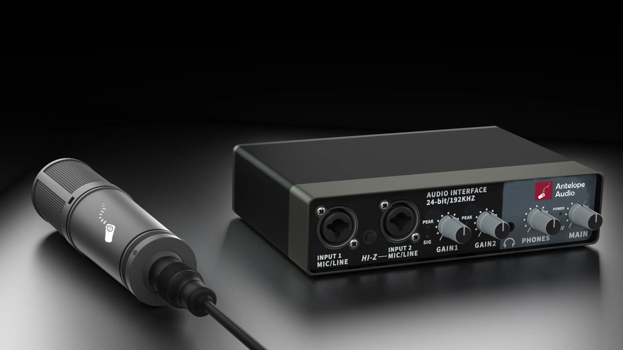
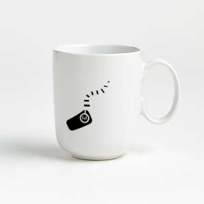
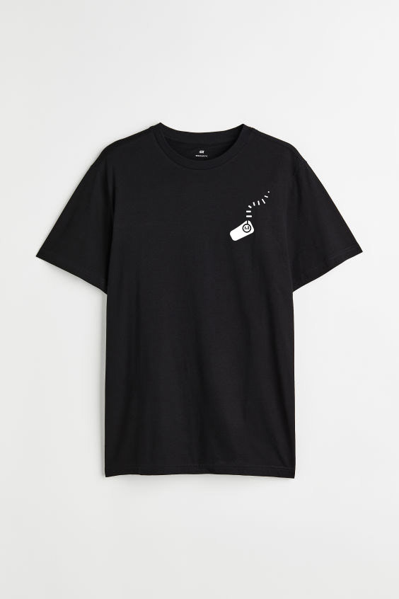
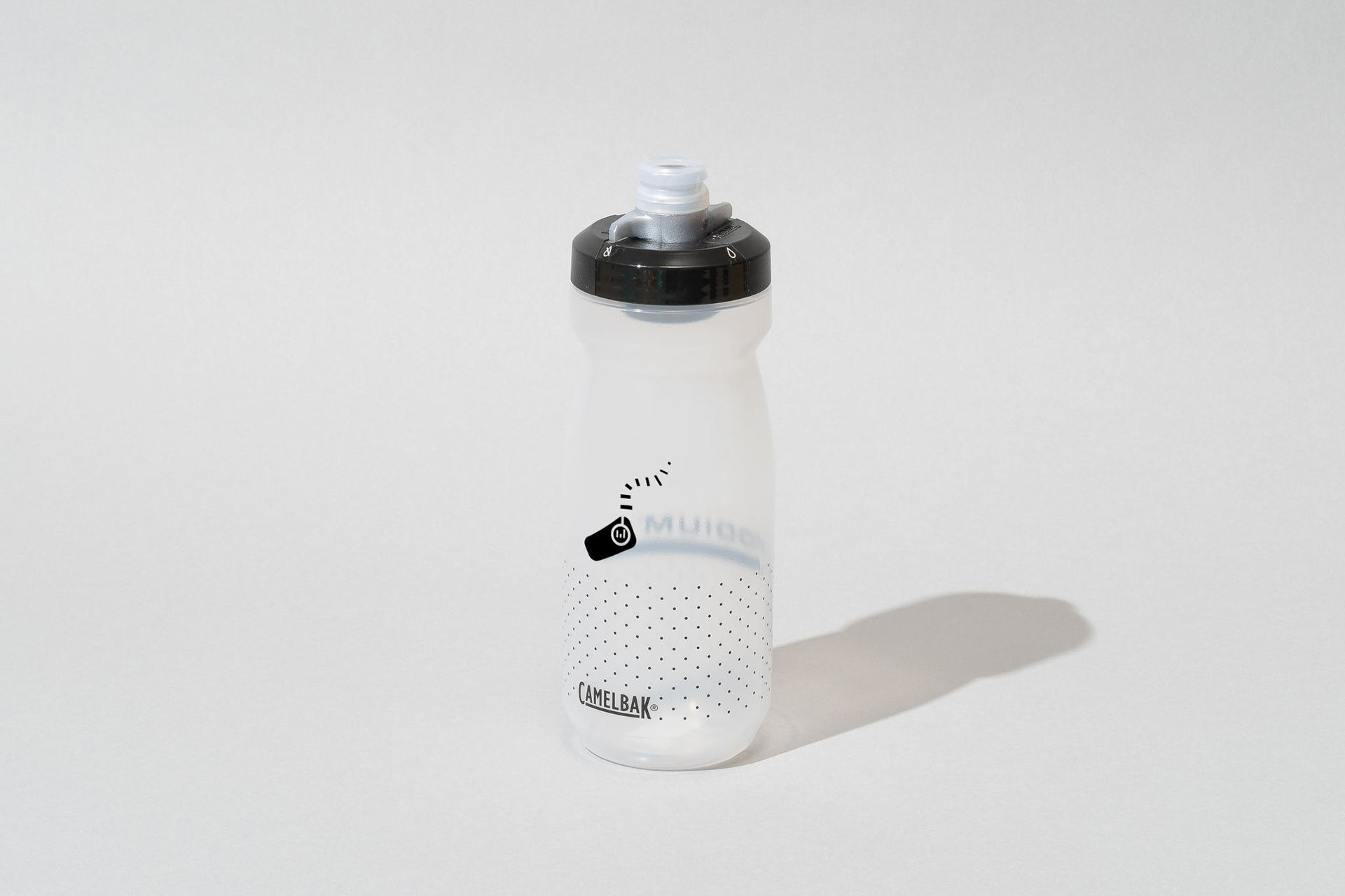
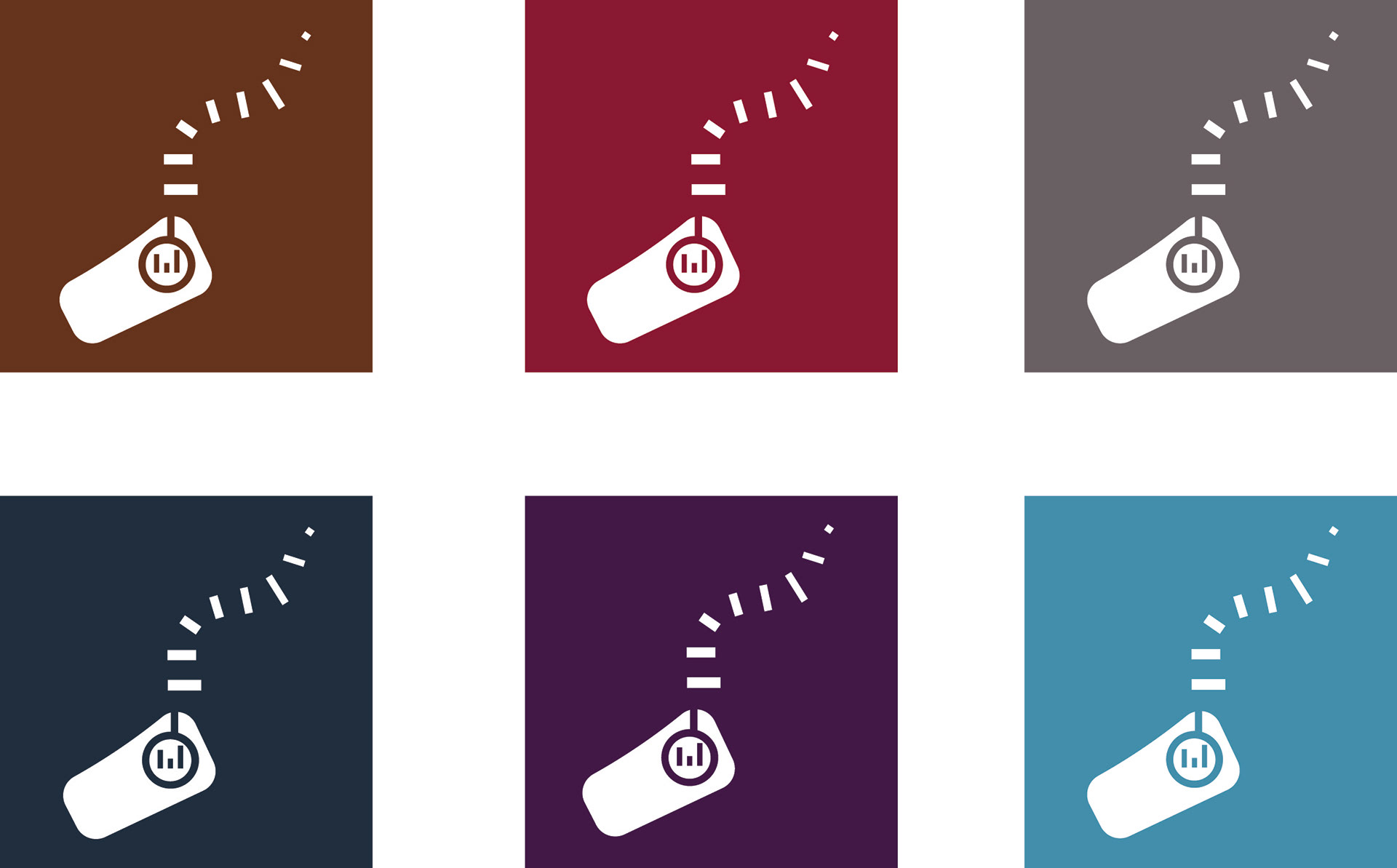
The redesigned logo for Antelope Audio aims to expand its appeal beyond music professionals by integrating musical elements with the symbolic qualities of an antelope, such as sensitivity and intuition, into a visually engaging design. The logo features a simplified side view of an antelope, with sound waves forming the horns and sound bars suggesting musicality. A circular shape and connecting line evoke headphones and a musical note, symbolizing an ear or eye enjoying sound. The Berlin Sans FB Regular typeface, with its soft curves and clean lines, harmonizes with the logo's shapes, reinforcing a modern, approachable feel. The brick red colour represents the brand's resilience and strength, while the square layout conveys confidence and stability.
The redesigned logo for Antelope Audio aims to expand its appeal beyond music professionals by integrating musical elements with the symbolic qualities of an antelope, such as sensitivity and intuition, into a visually engaging design. The logo features a simplified side view of an antelope, with sound waves forming the horns and sound bars suggesting musicality. A circular shape and connecting line evoke headphones and a musical note, symbolizing an ear or eye enjoying sound. The Berlin Sans FB Regular typeface, with its soft curves and clean lines, harmonizes with the logo's shapes, reinforcing a modern, approachable feel. The brick red colour represents the brand's resilience and strength, while the square layout conveys confidence and stability.
Final Composition


Mockup